
Your Organizing Studio
Website Redesign
May 2023 - August 2023
Web Design, Information Architecture, SEO
Background
Your Organizing Studio is a professional organizing business focused on decluttering and simplifying clients' lives through the creation of personalized systems. In 2023, the company underwent a rebranding and needed its website to reflect its new brand identity.
Throughout this project, I collaborated closely with the founder to ensure the final output aligned with her vision while providing guidance through the design process.
Problem
The original website appeared outdated and did not align with the new branding. It was essential to modernize the site to reflect the refreshed brand identity and appeal to current and potential clients.
I discussed the vision and desired changes with the founder of Your Organizing Studio. Initially, she only wanted a website redesign. However, after analyzing her web traffic statistics, I noted that a large percentage of viewers accessed the site via mobile devices. I explained that clients are more likely to search for the business on their phones than on computers. I explained the importance of having a site that is functional accross all devices as many of her clients are busy and constantly "on the go."
Together, we developed specific goals for the new site to ensure it met user needs and aligned with the updated brand identity.
Goals
- Update Branding - Ensure the website reflects the new brand identity.
- Modernize Layout - Redesign the site with a contemporary and appealing layout.
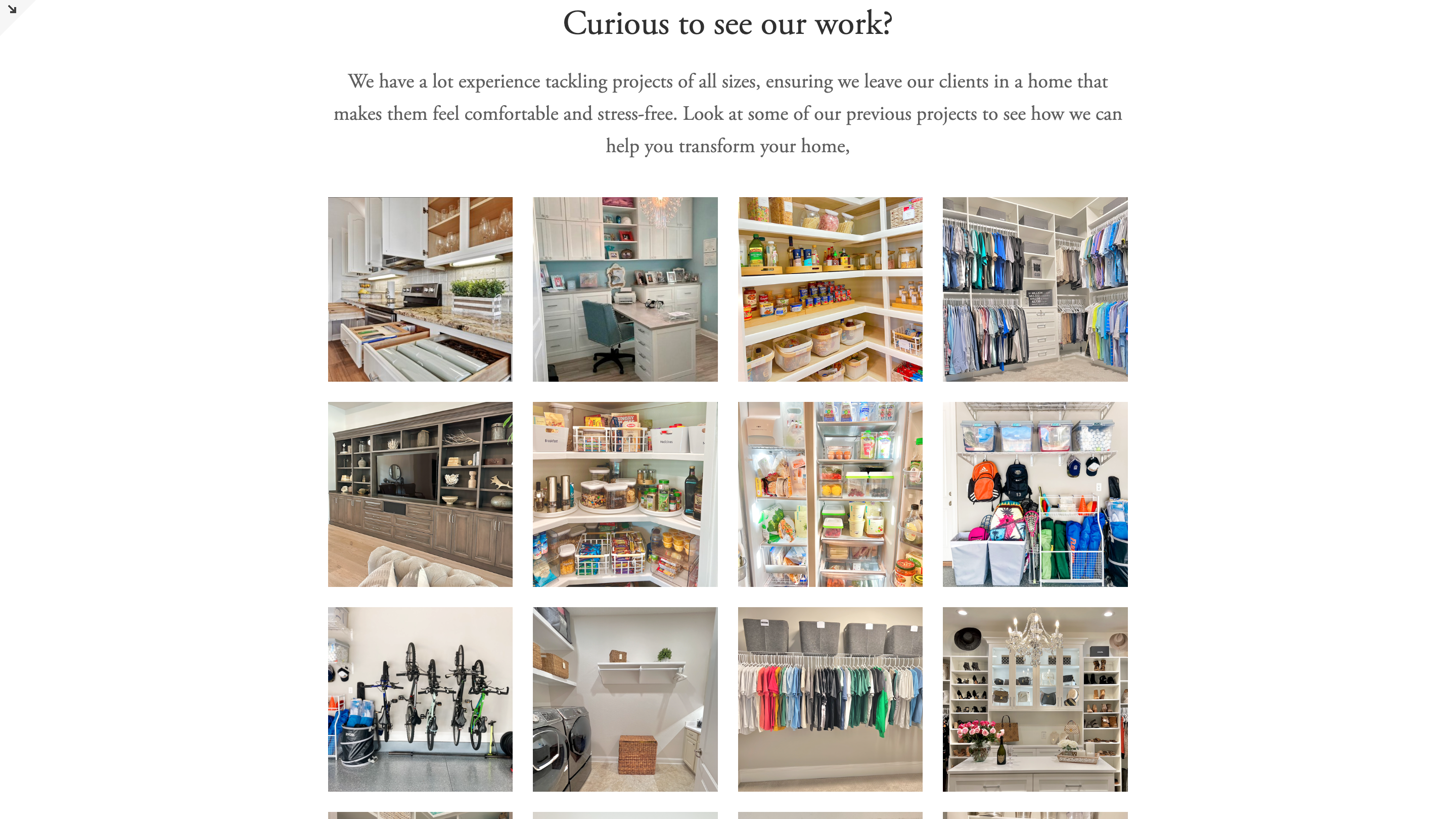
- Create a Portfolio Section - Highlight projects and provide a visual representation of previous work.
- Improve Navigation - Fix the navigation setup to enhance user experience.
- Ensure Multi-Platform Functionality - Develop a site that is functional and visually appealing across multiple platforms, including mobile devices.
Methods
With a clearer vision and agreed-upon expectations, I began creating the wireframes for the site. The design focused primarily on desktop users but was also developed to function seamlessly on mobile devices.
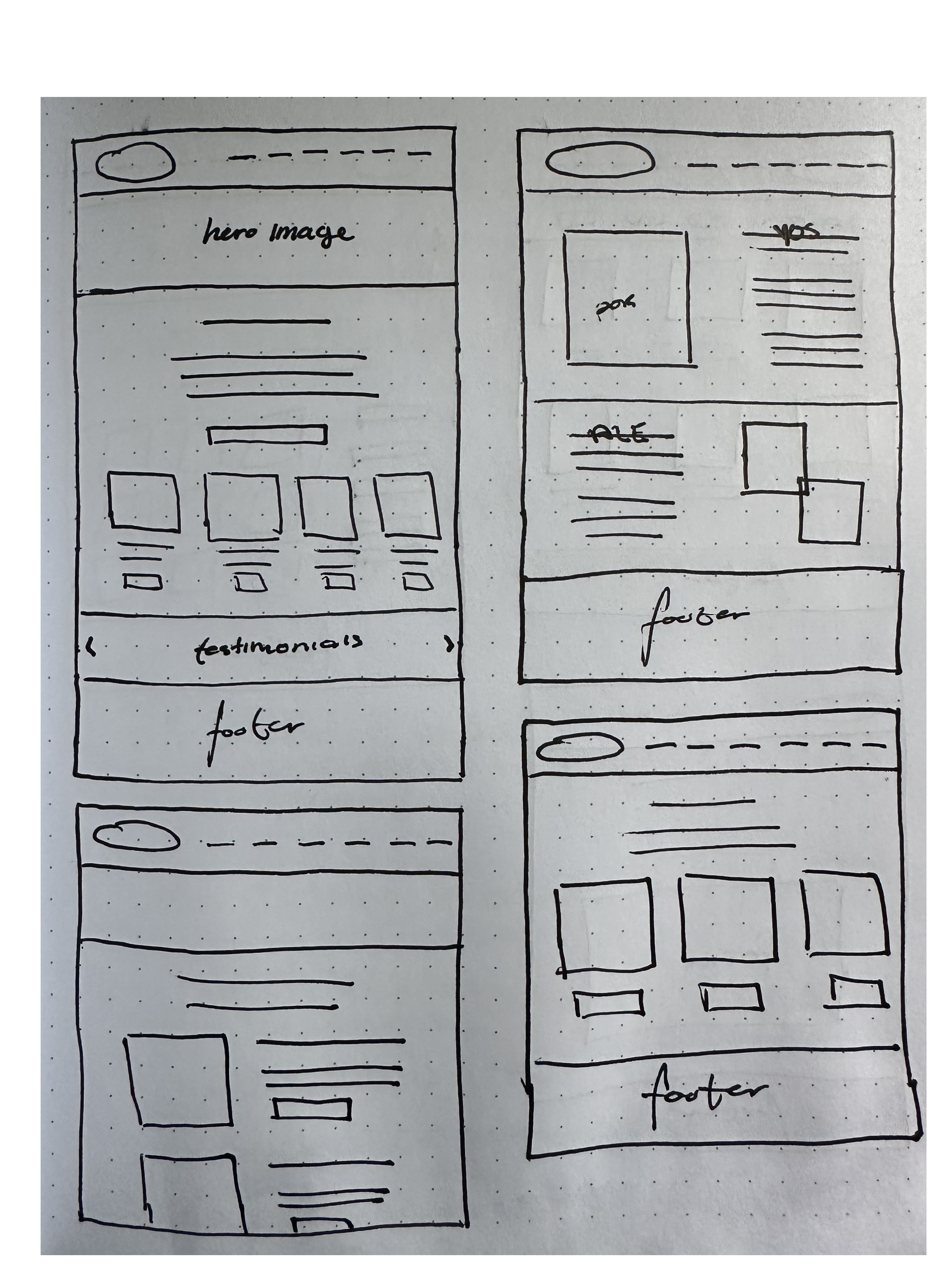
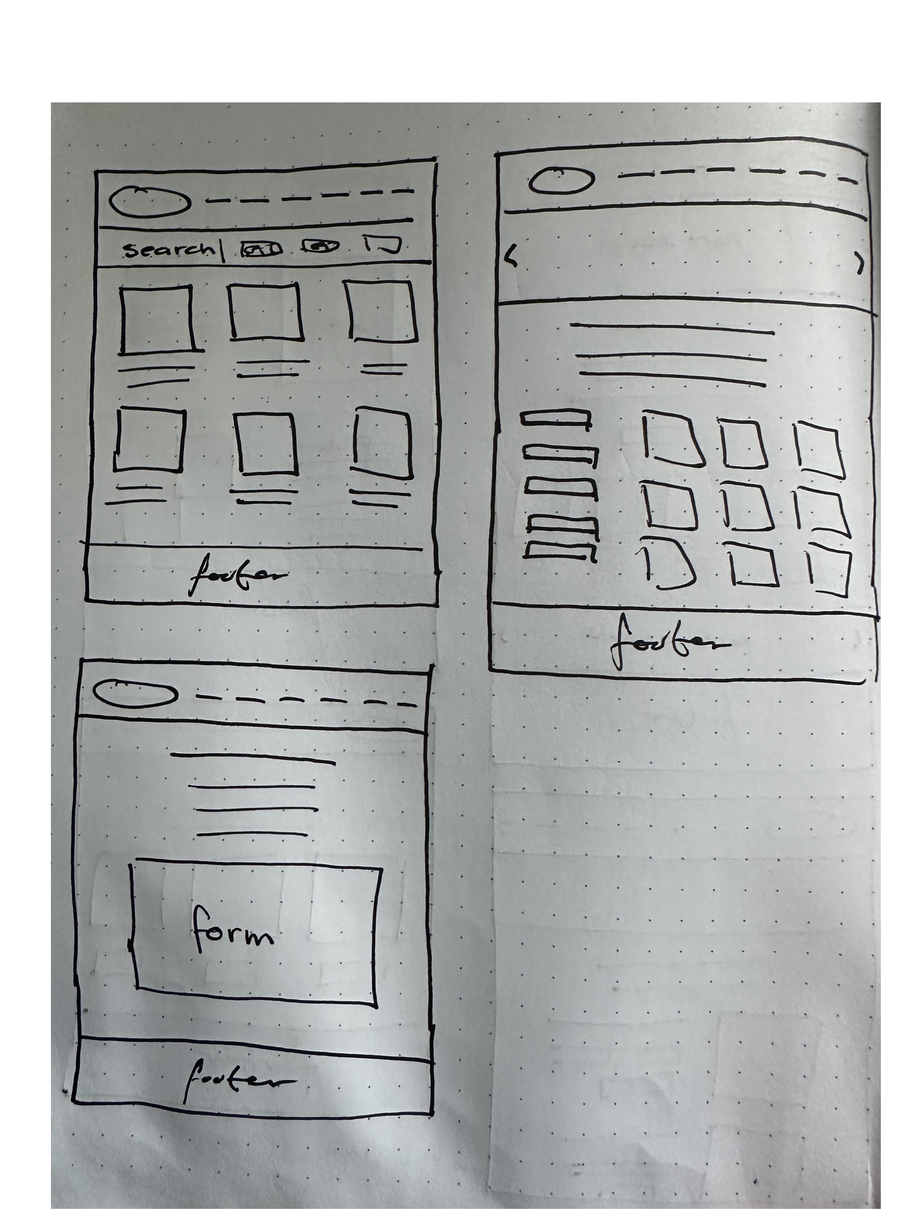
After discussing the wireframe and its functionality with the client, I incorporated her input and created the first prototype iteration.


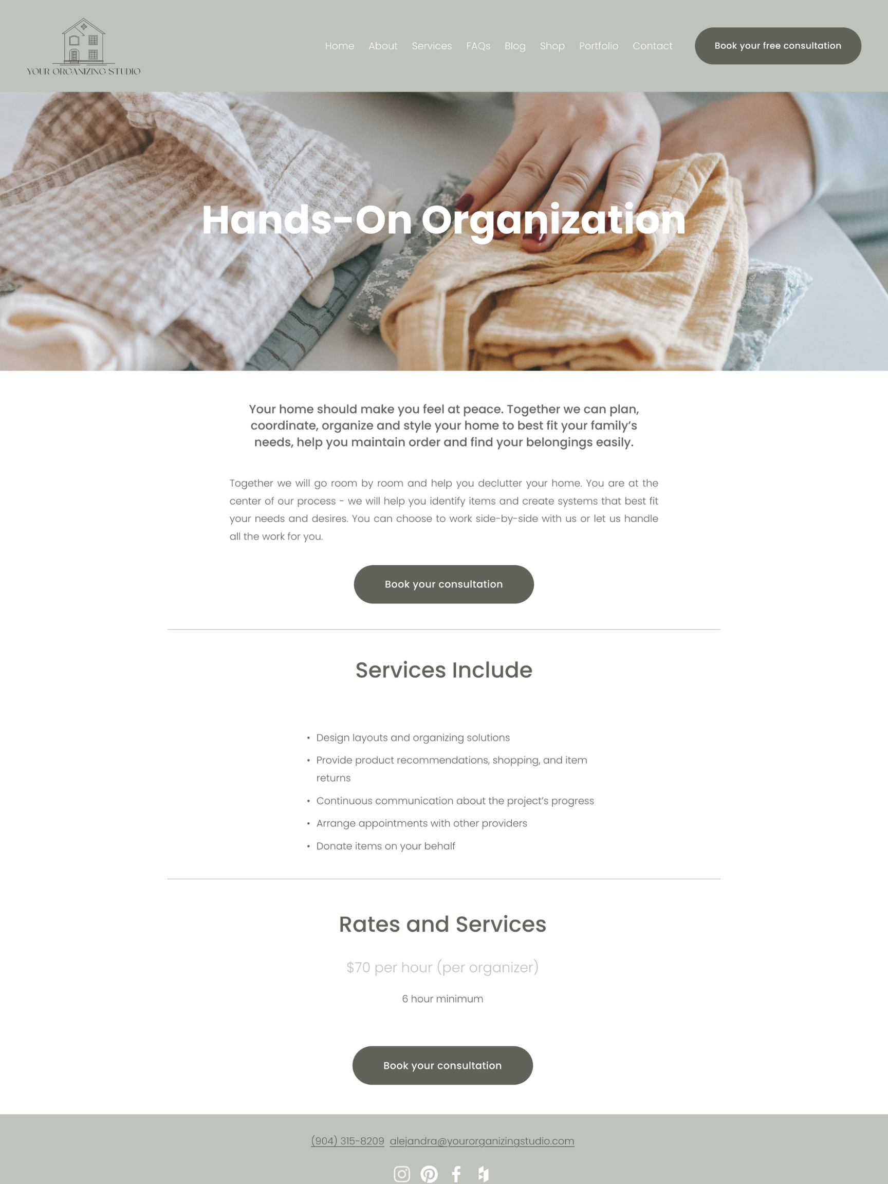
I presented the first iteration to the client to help her visualize how the pages would function. While she was generally pleased, she revised some of her preferences after seeing the functioning prototype. The changes she requested included:
- - Adding the logo to the navigation bar.
- - Incorporating more dark green into the design.
- - Reducing the size of the footer.
- - Simplifying the services page to focus primarily on images, -with each service presented in a more streamlined design.
- - Moving the FAQ section to its own dedicated page.
As I began working on these changes, SquareSpace released a significant update that would drastically improve functionality and SEO. However, this update required recreating the website from scratch and later reconnecting the domain to the new site. I ensured the client was aware of this development, communicated the timeline changes, and explained the benefits of the update. She approved, and I proceeded to start from scratch with more creative leeway.
Taking previous conversations and feedback into consideration, I rebuilt the site from scratch. I also revised the wording, with the client's approval, to improve SEO and enhance comprehension of the products and services offered.
Final Product

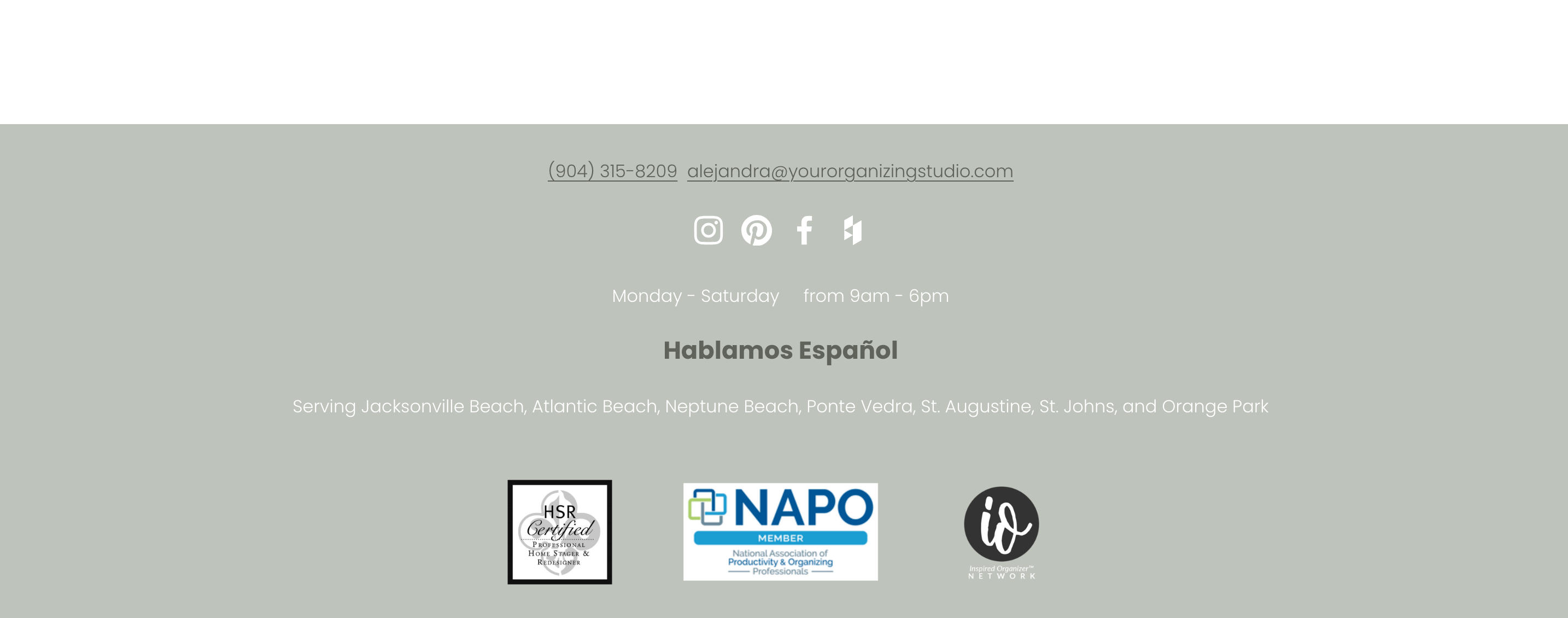
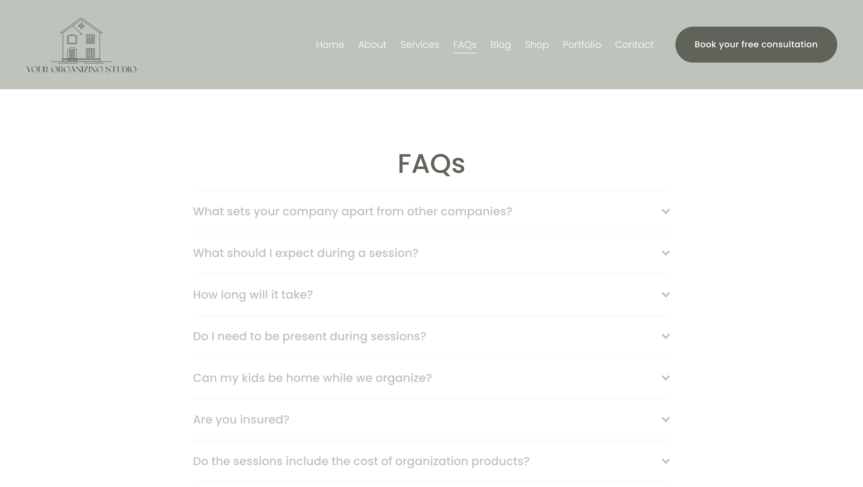
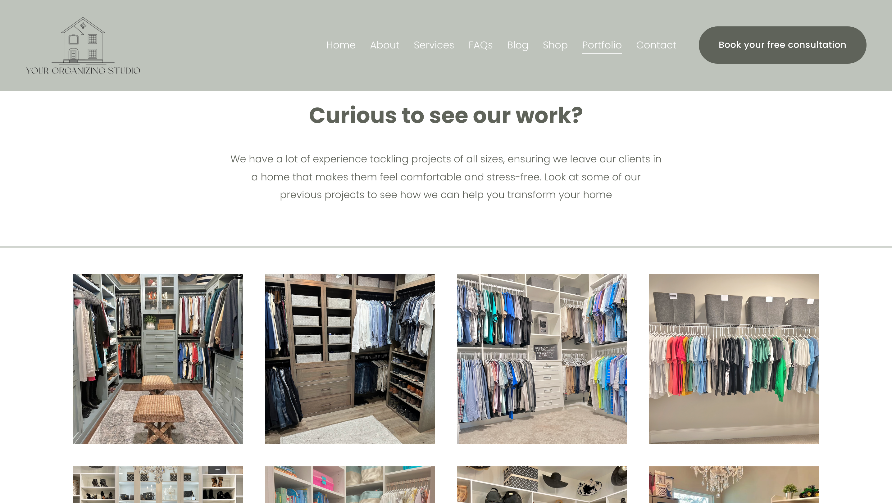

Key takeaways
- Effective Client Communication - Learned the importance of clear and consistent communication with clients to understand their vision and expectations.
- Prioritizing Client Desires - Developed the ability to prioritize the client's preferences over personal design choices, especially regarding aesthetics. While I had my own ideas, the client's vision was paramount as it is her business.
- Balancing Aesthetics and Functionality - When it came to functionality, I communicated the pros and cons of various options, explaining why certain approaches might be better. This ensured the client was well-informed and could make decisions that balanced both design and usability.
View other projects here: