advnt
Website Creation
March 2024 - April 2024
Web Design, Information Architecture
Background
advnt is a creative advertising portfolio highlighting the talent of the University of Florida's students. In 2024, advnt decided to redesign its website from scratch. The previous site did not fit the organization's branding and did not have a favorable user experience. My team was in charge of fixing key issues the previous site experienced.
Goals
- Create a custom URL
- Create a site that fits into advnt's branding
- Make it easy to update and upload new content
Methods
The first step in redesigning advnt's website was to have an honest discussion with my team to evaluate what worked and what did not with the original site. We identified several key issues that needed addressing.
- URL - The organization is not paying for a domain making the URL seem unprofessional and unnecessarily lengthy.
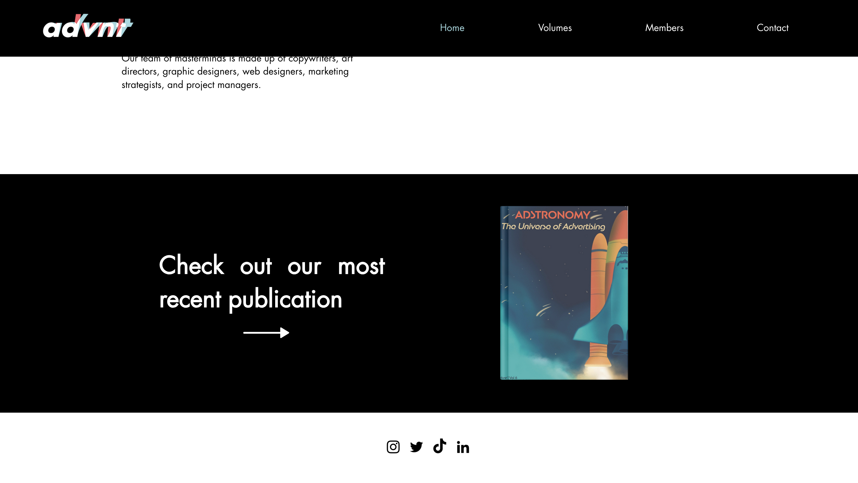
- Landing Page - The landing page did no encourage exploration and did not include a call to action. It was simply the organization's logo.
- Visual Design - The visual design of the site did not align with advnt's branding. It was inconsistent and lacked the quirky and personalized touch that defines the brand identity.
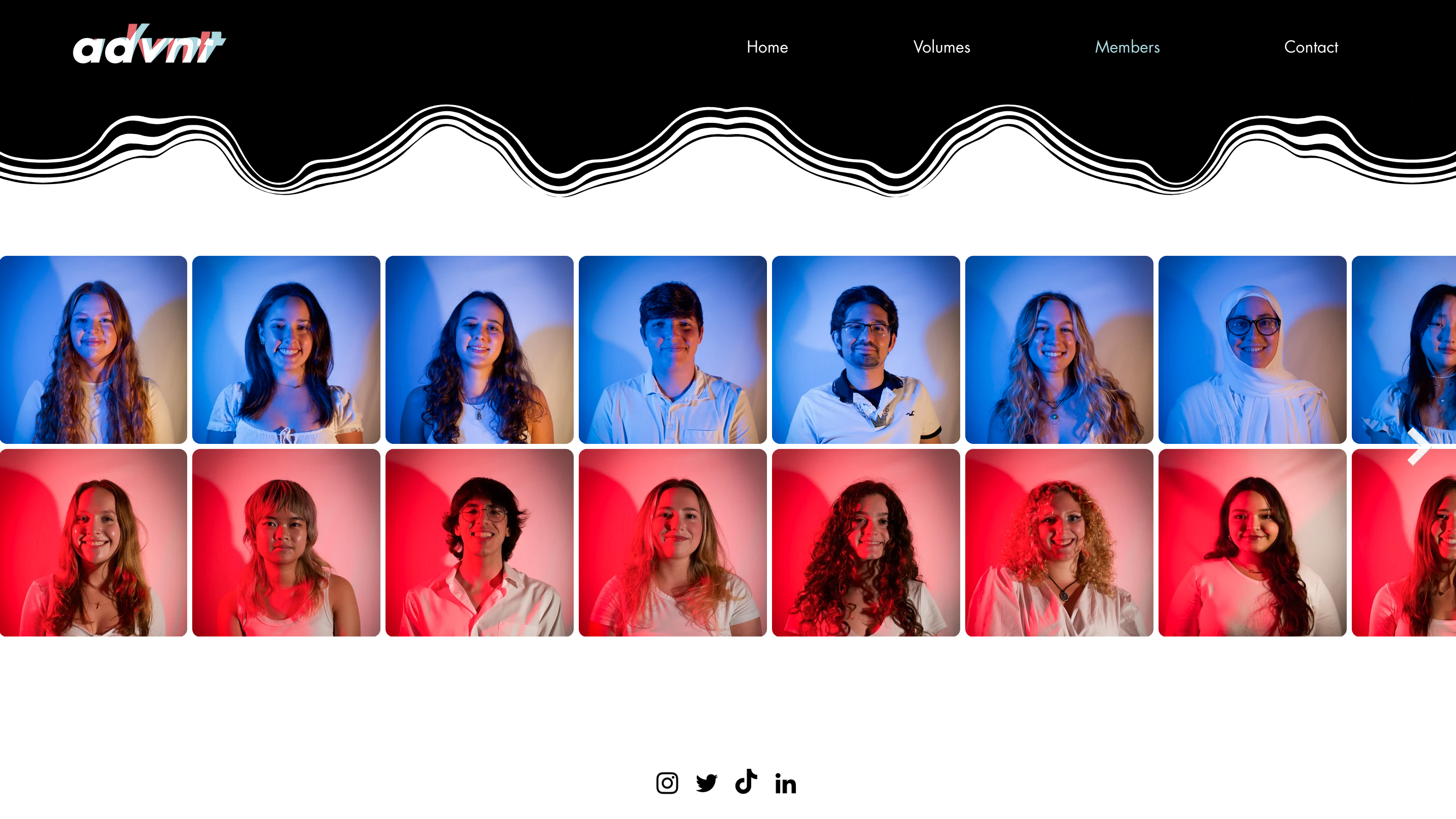
- Portfolio - The purpose of the portfolio page was to highlight the team members who worked on the release of each volume. However, advnt did not have access to previous volume members information and was deemed as unrealistic to maintain. Additionally, the portfolio did not adhere to our brand guidelines.
- Advnt on Film - The goal was to showcase group photos, which was a nice idea, but it was not practical and did not happen as planned. The pictures were clearly all taken in one sitting and did not match the desired aesthetic.
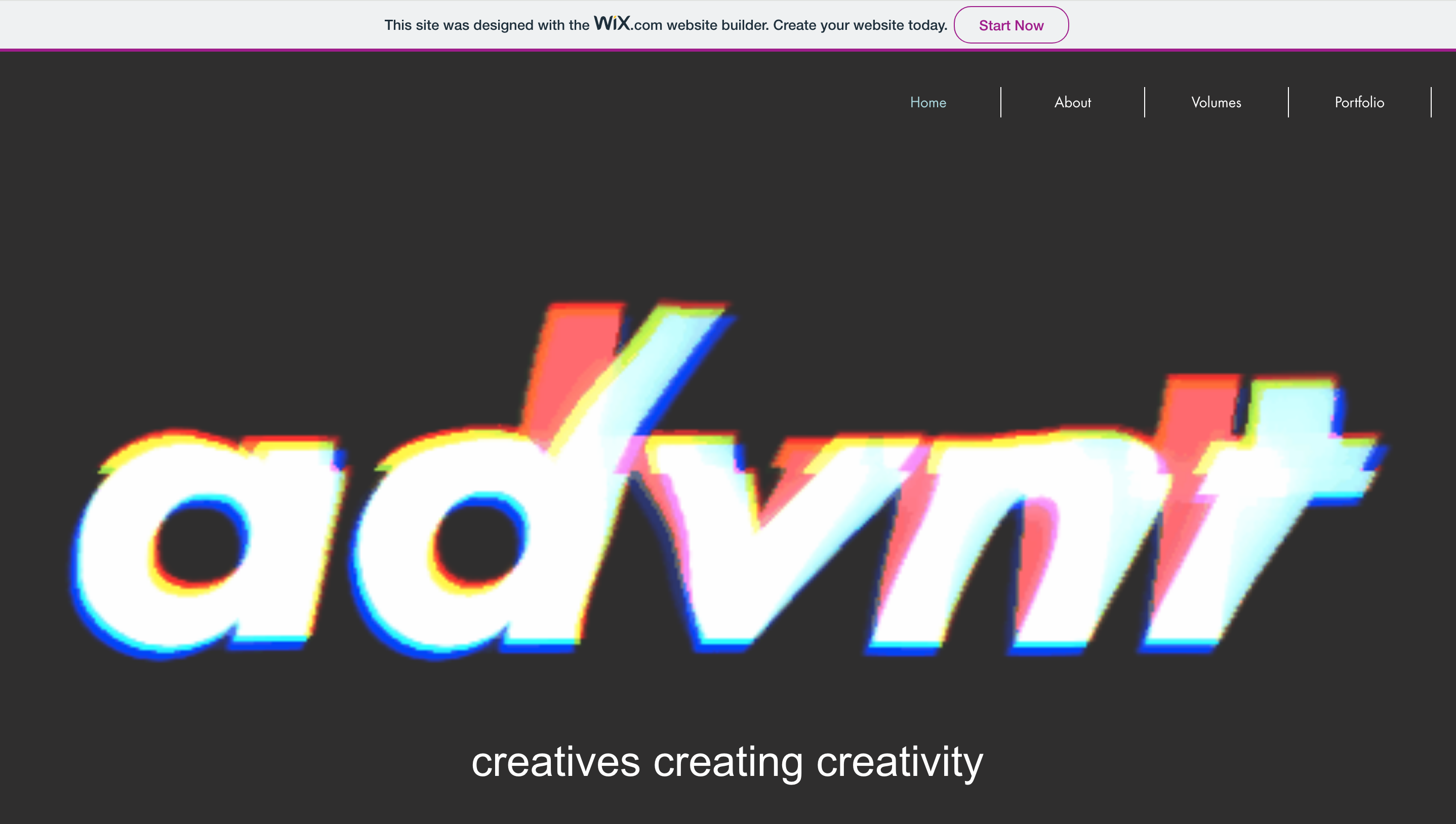
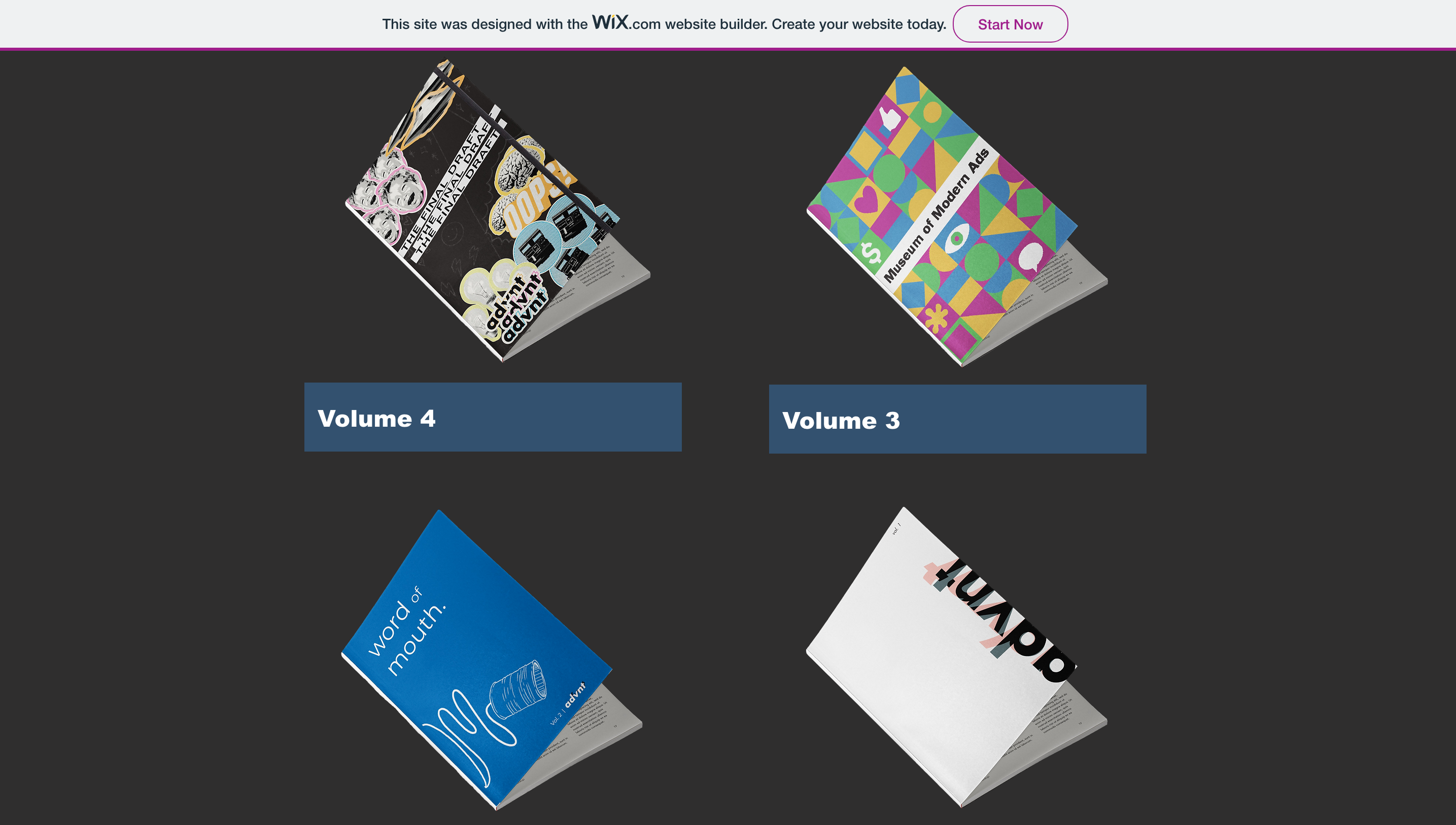
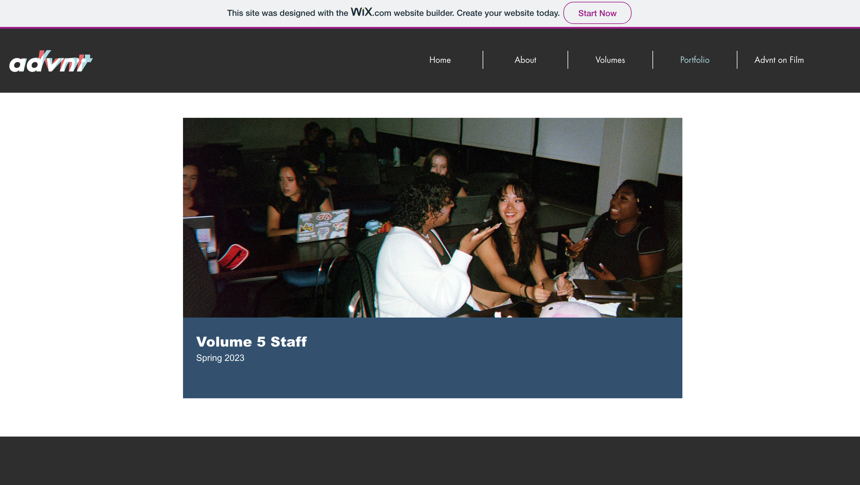
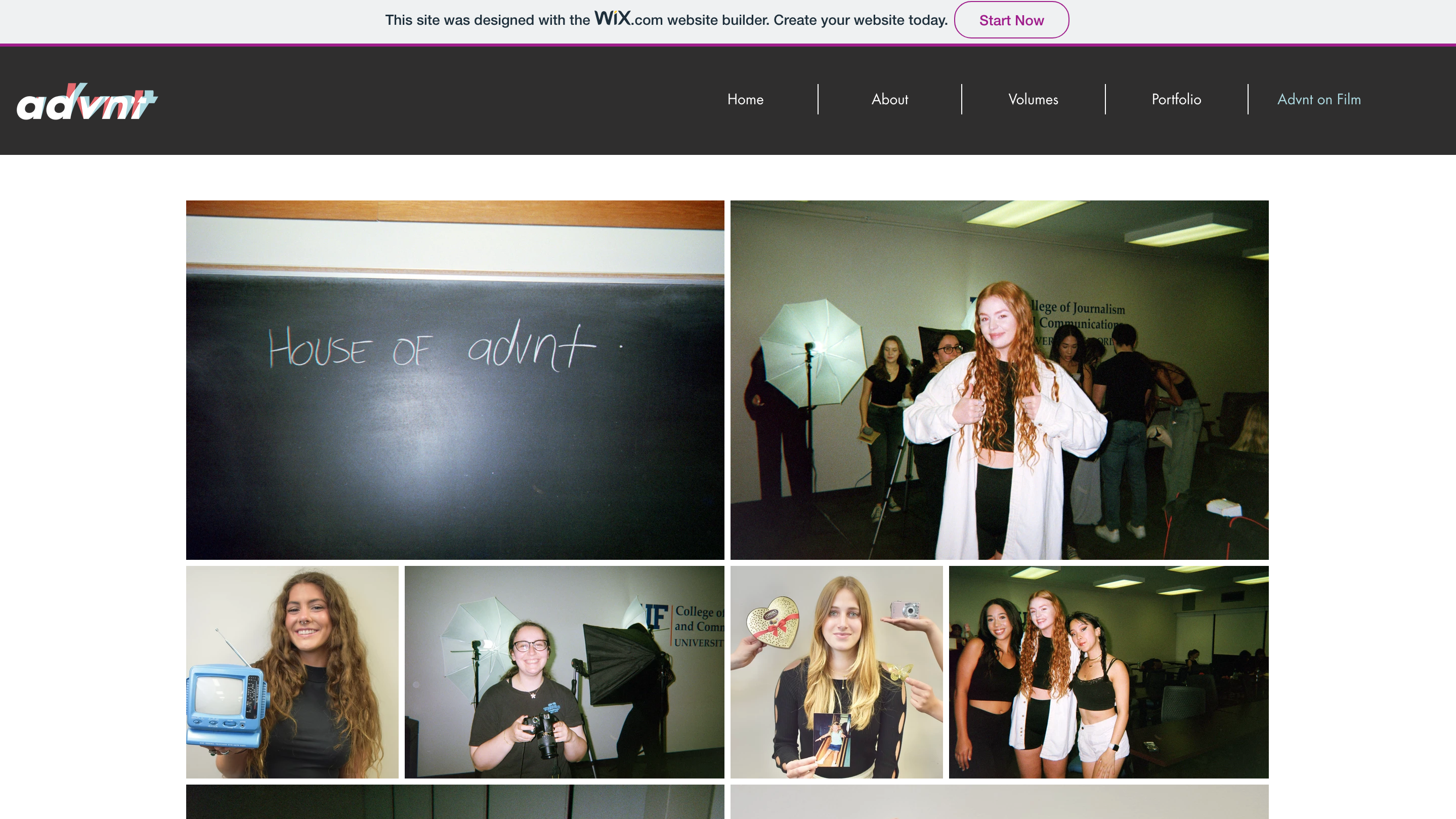
After examining the previous site design, we began discussing the features we wanted to incorporate into the new design. Based on our discussion, my team and I decided on the following changes:
- Merge the Landing and About pages: Combining these pages to create a more cohesive and streamlined user experience.
- Remove the advnt on Film section: This section was not practical and did not align with our new design goals.
- Revise page layouts: Update the layout of each page to improve navigation and enhance the overall user experience.
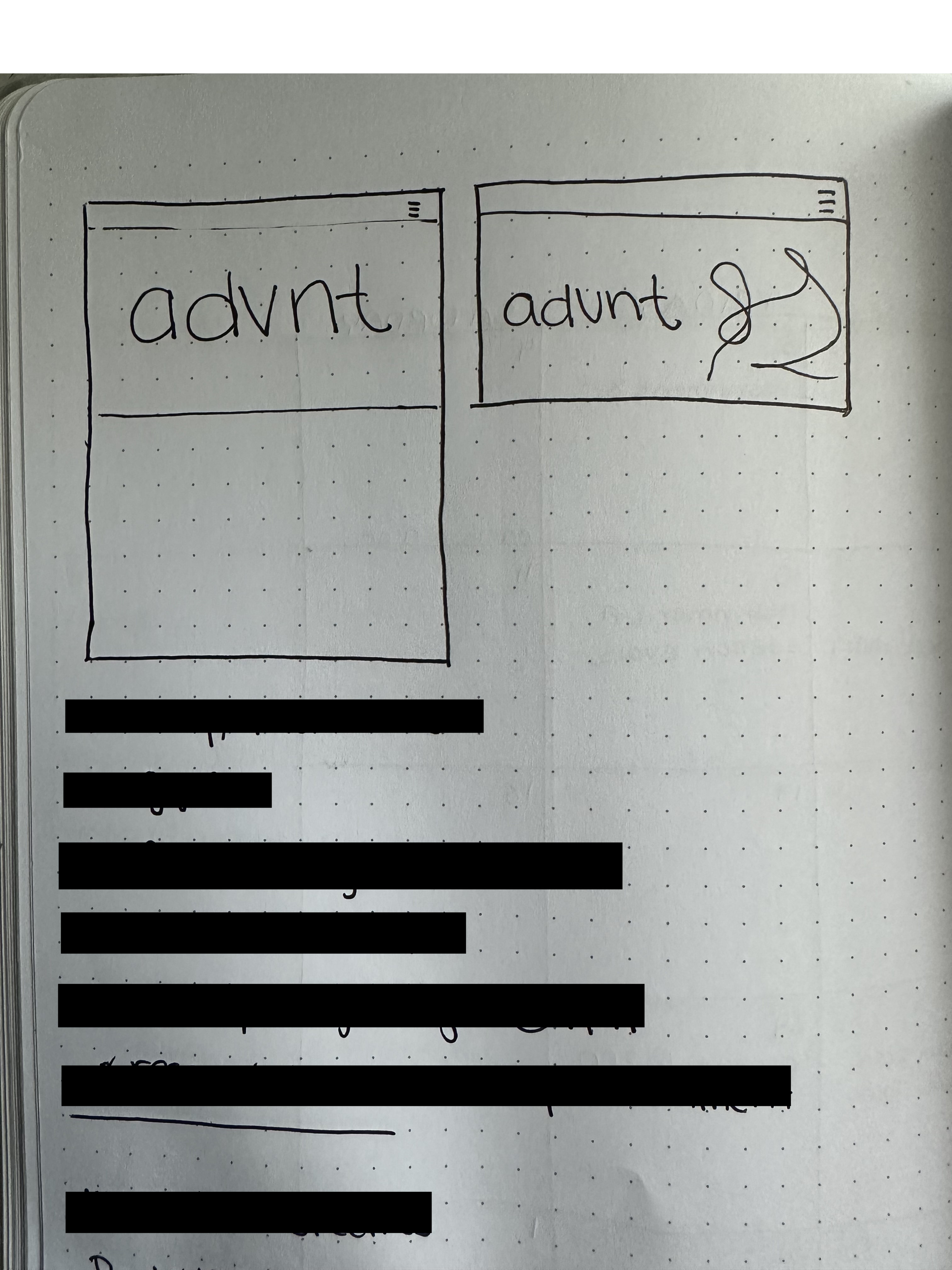
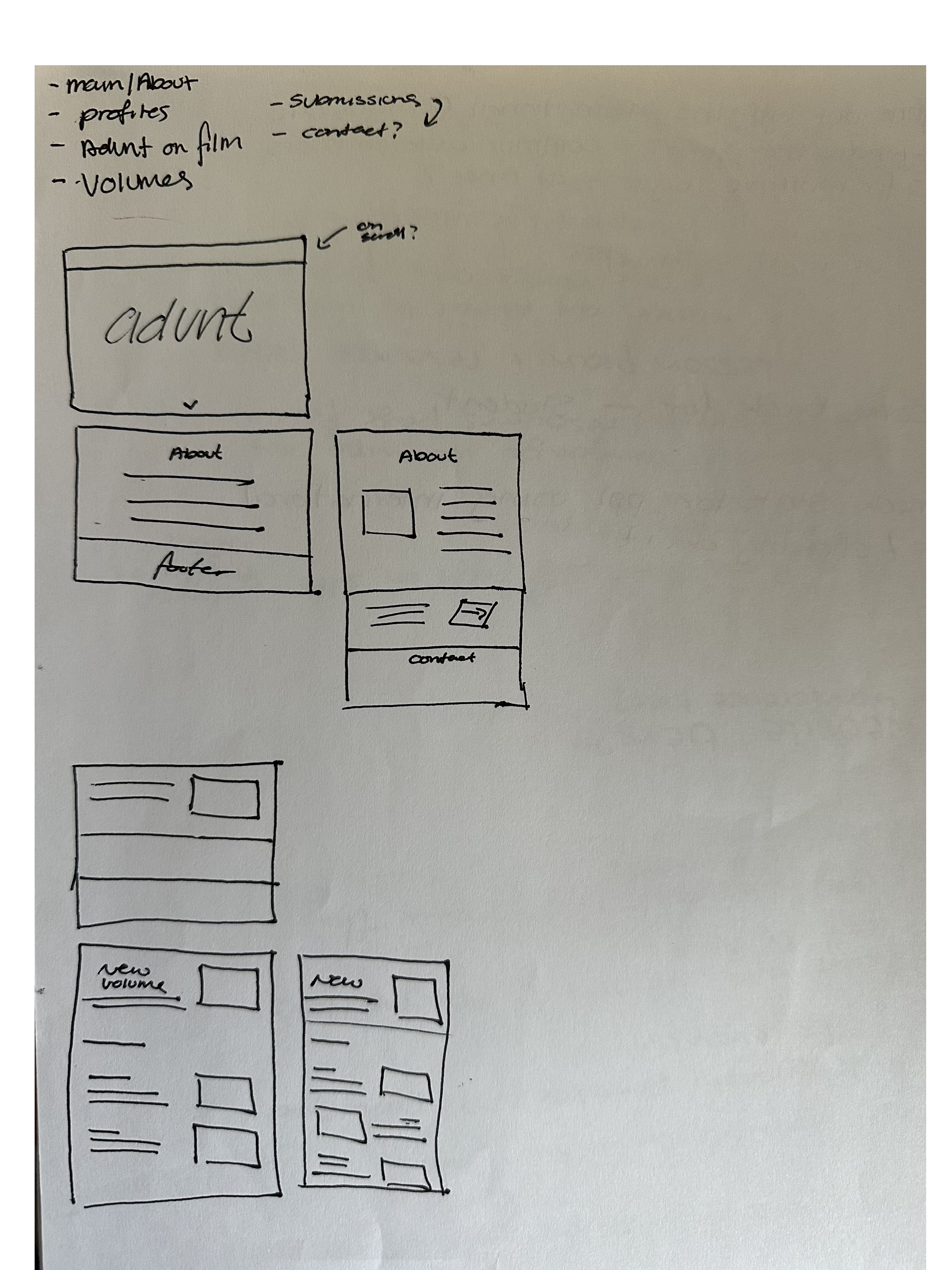
Once we finalized the overall layout, we moved on to discussing the design elements.
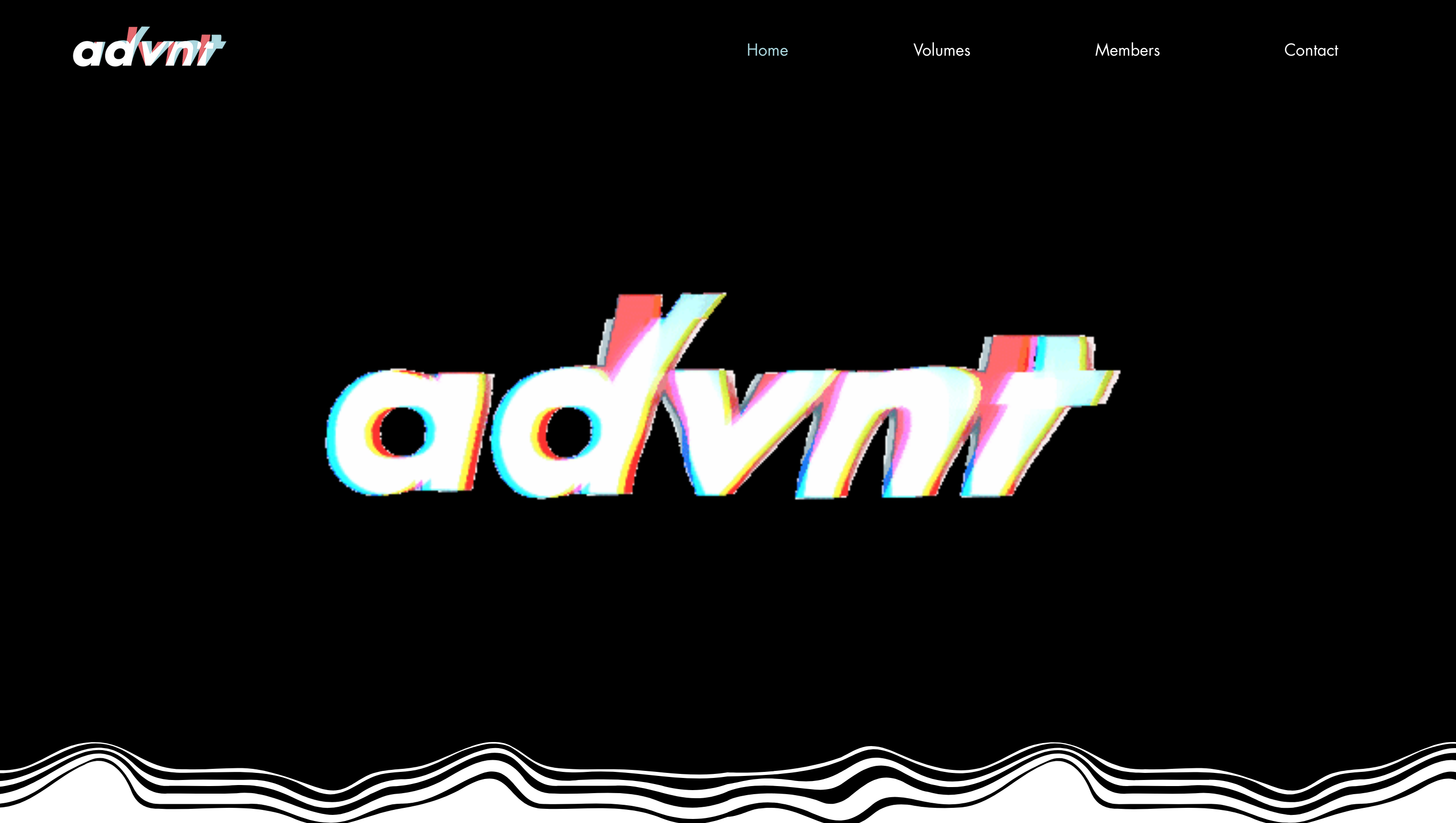
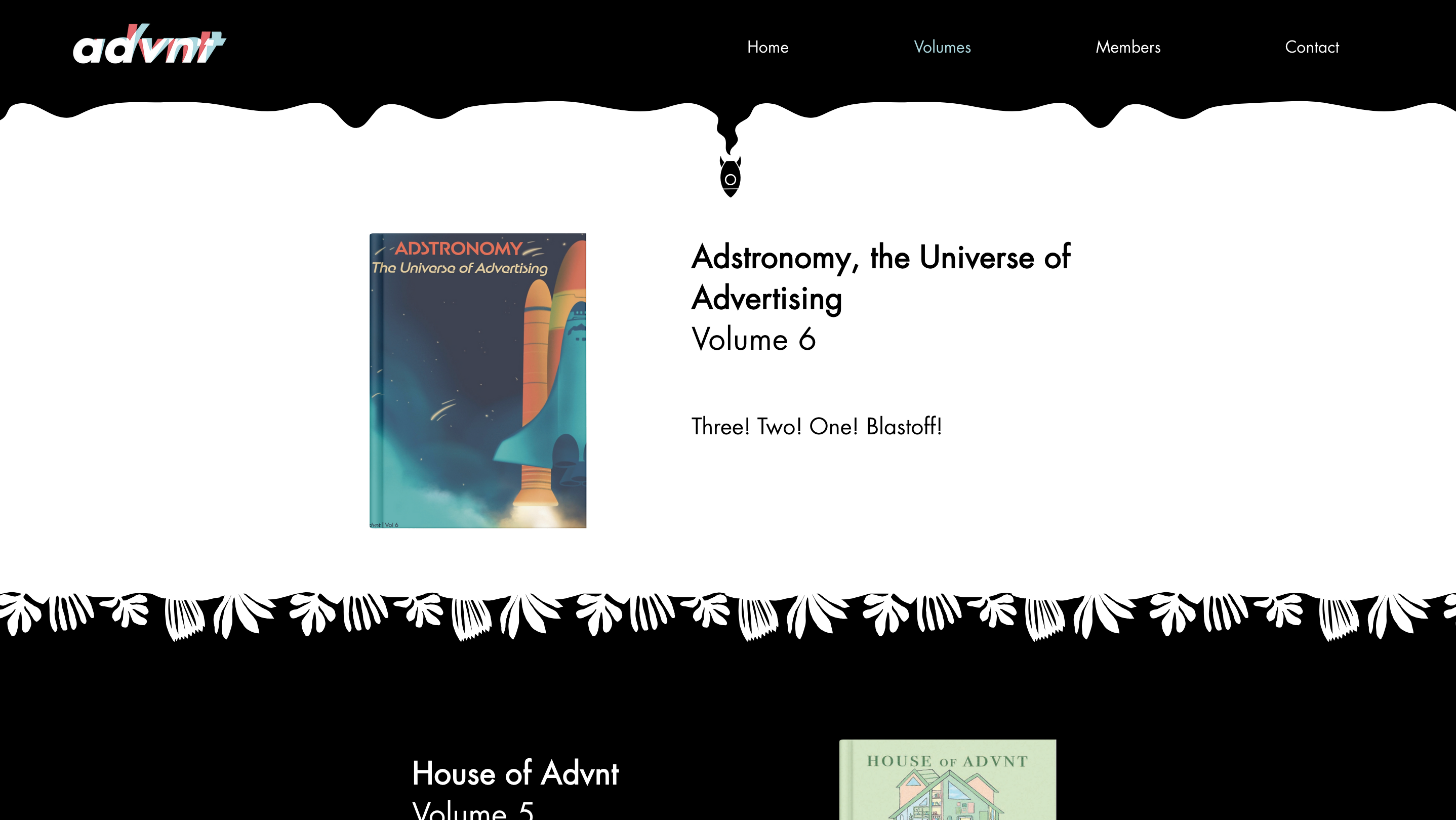
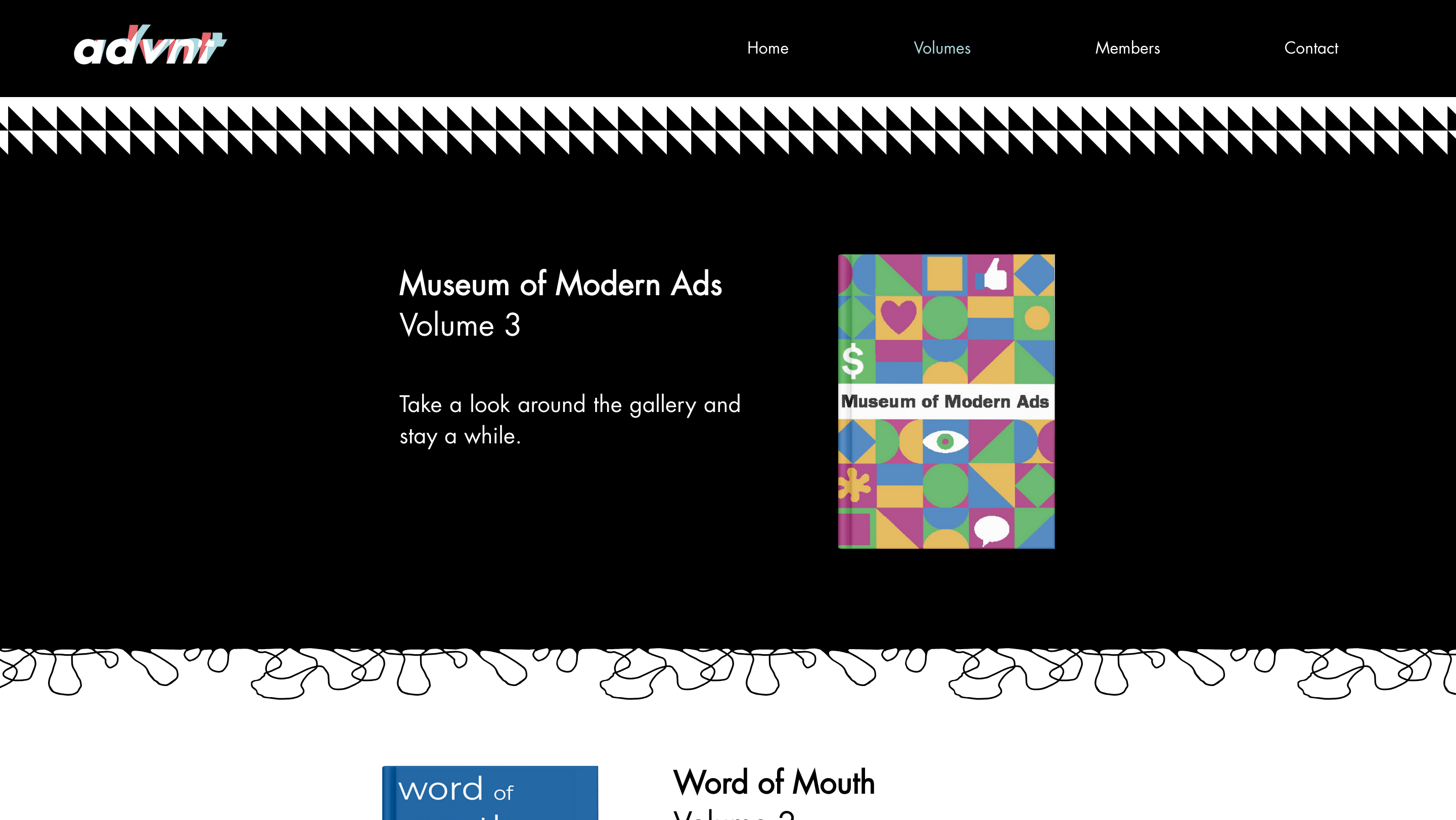
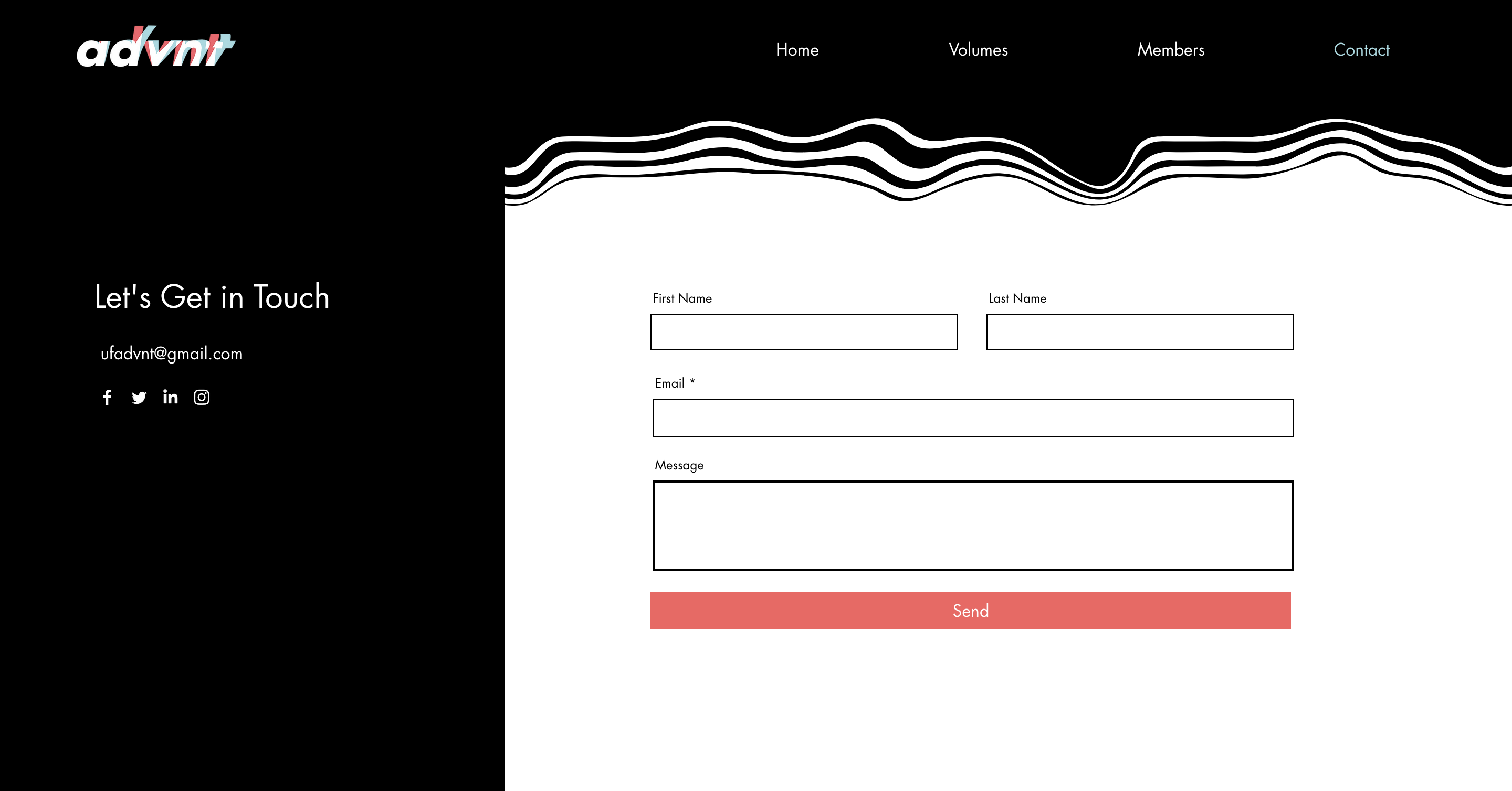
To align with the brand guidelines, we decided to keep the site simple and primarily black and white. This approach would allow the volumes and images to stand out more with their added colors.
While our color choices were simple, we aimed to create an "edgy" look by incorporating patterns and designs. These elements would add personality and interest to the pages without being too distracting.
After discussing our vision, we communicated with the graphic design team and the copywriters to help us achieve this look.
Final Product
Key takeaways
Completing this project highlighted the importance of setting clear expectations and maintaining transparent communication. Although the previous site met expectations on paper, its execution fell short. For the new site, I ensured a thorough understanding of the requirements and clearly communicated roles and expectations to all teams, preventing misunderstandings and ensuring successful implementation.
This project also taught me the importance of effective teamwork. While I helped the web design team develop the vision, we relied on the graphics and copywriting teams to create the content for the site. Despite its small scale, collaboration was crucial to achieving a successful outcome.
View other projects here: