Gameful Wellness
App Design
Februry 2024 - April 2024
Product Design, User Research, Prototyping and Information Architecture
Background
My team embarked on developing a gamified self-care app to tackle the widespread challenge young adults face in establishing and maintaining healthy self-care habits. Recognizing the increasing popularity of gamification, we saw an opportunity to create an engaging solution that promotes personal development and mental well-being. By integrating entertaining elements, we aimed to make self-care practices more accessible and enjoyable, ultimately fostering long-term healthy habits.
Problem
Young adults often struggle to build and maintain healthy routines due to a lack of motivation and difficulty feeling in the right "mood" for specific self-care activities.
Goals
- Develop a Gamified Self-Care App - Create an app that helps users build and maintain healthy habits through engaging gamification techniques.
- Foster a Supportive Environment - Design the app to cultivate a positive and encouraging atmosphere for users.
- Offer Customizable Options - Provide features that allow users to engage in self-care activities based on their moods, enhancing personalization and engagement.
Market Trends
- Rise in Gamification of Apps - Increasing popularity of apps that incorporate game-like elements to enhance user engagement.
- - Blend of Entertainment and Personal Development Growing trend of apps that combine entertainment with self-improvement features.
- Social-Based Apps - Increased demand for apps that foster social interaction and community building.
- Focus on Mental Health - Mental health has become a prominent topic, with more users seeking apps that support well-being and mental health.
Competition Analysis
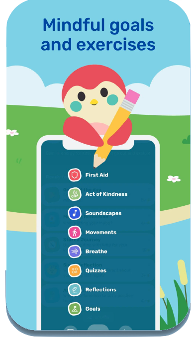
Finch: Self-care Pet
- Goal setting
- Habit tracking
- Gamification
- Reflection
- Recommendations
- Mood tracking
- User base: 242k
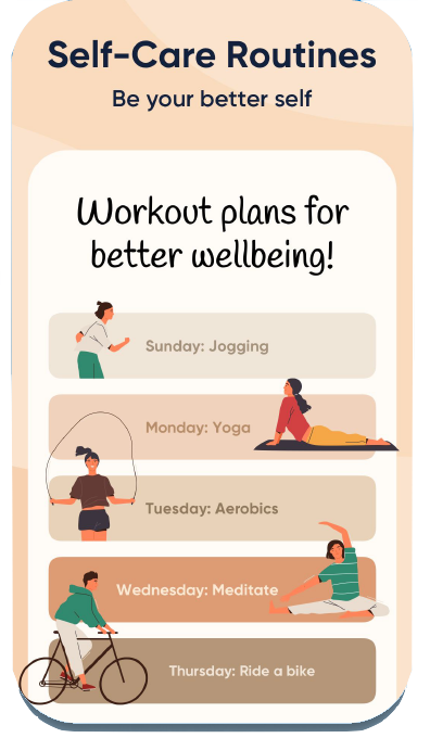
Me+ Daily Routine Planning
- Goal setting
- Habit tracking
- Reflection
- User base: 114k
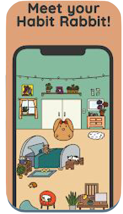
Habit Rabit: Habit Tracker
- Goal setting
- Habit tracking
- Gamification
- Mood tracking
- User base: 4.5k
Target Audience
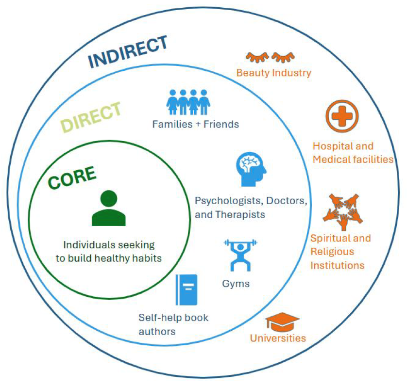
Our target users are adults between the ages of 18-30 who have an interest in mobile and video games. They are attracted to apps that gamify experiences, particularly those that can be played with friends. These users enjoy sharing discoveries and trying new activities. They are interested in self-improvement and enhancing their well-being. Notably, they are often more motivated to take care of themselves when it involves supporting their friends.
User Research
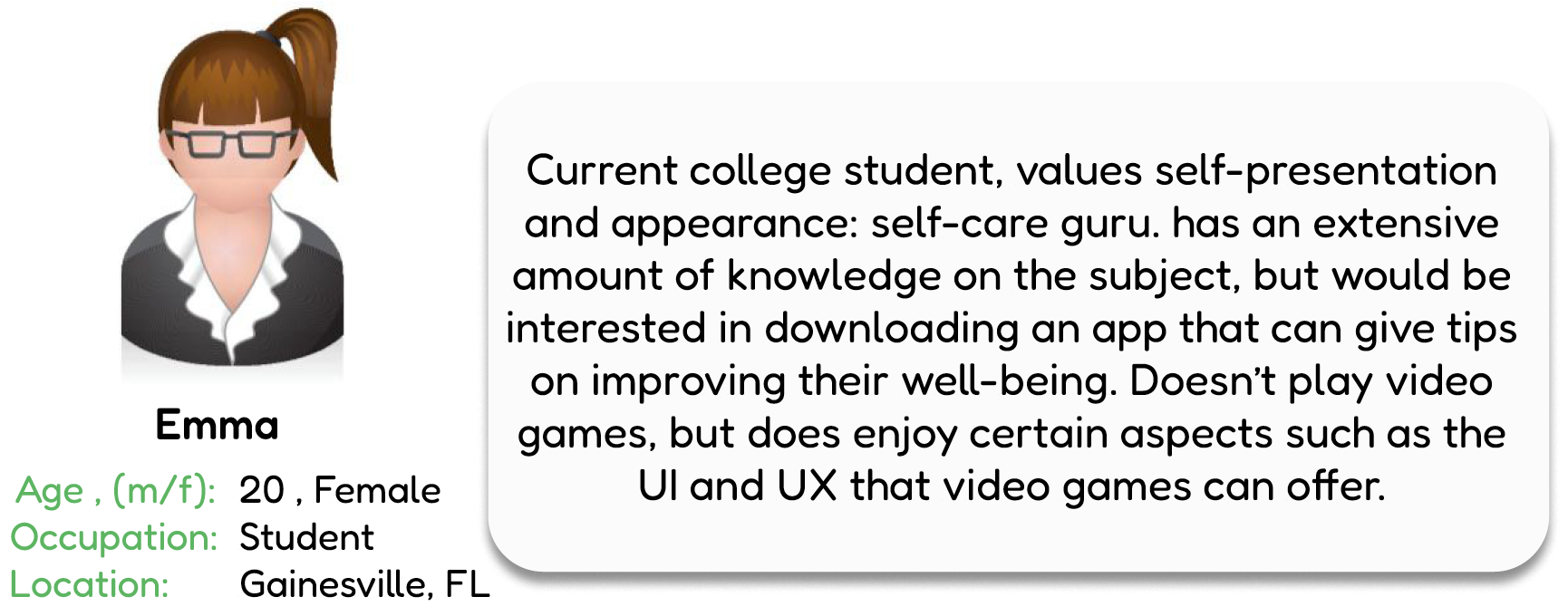
During our user research phase, we conducted interviews with individuals from diverse backgrounds. Our interviewees were aged between 20-30 and had an interest in either games or self-care practices.
What does this mean for us?
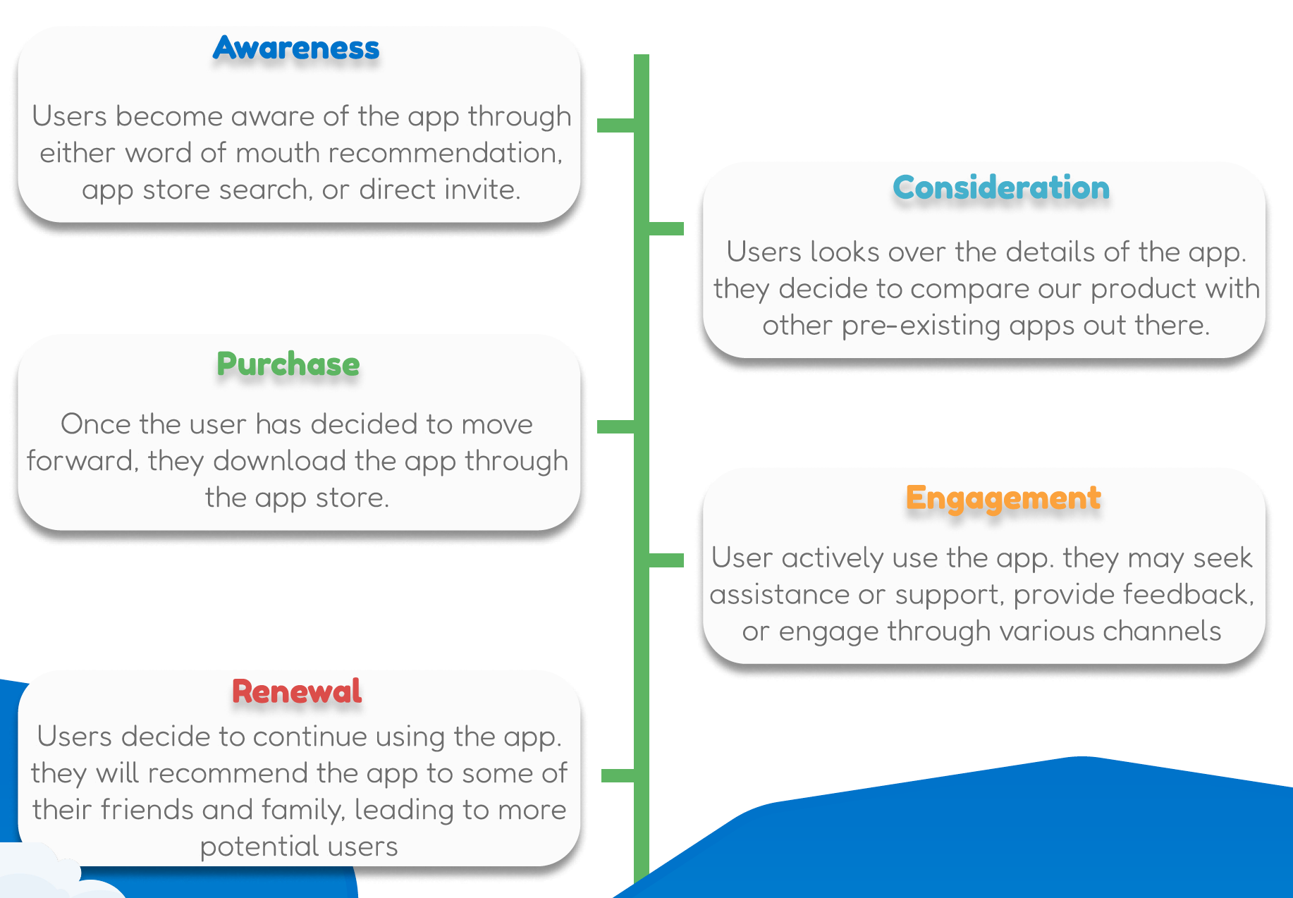
Our analysis revealed that not many self-care apps effectively gamify the user experience while also providing online communities. Additionally, we found that Gen Z individuals are more inclined to help others before themselves. This demographic, along with young adults, has a strong desire for community and belonging. These insights highlight a unique opportunity for our app to fill a gap in the market by combining gamified self-care with a supportive online community.
Design Requirements
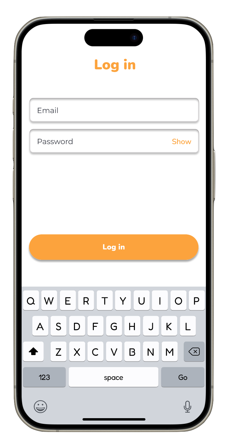
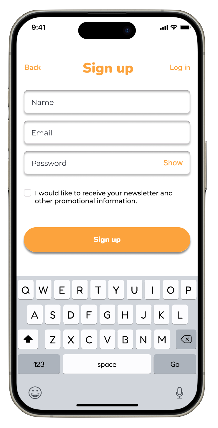
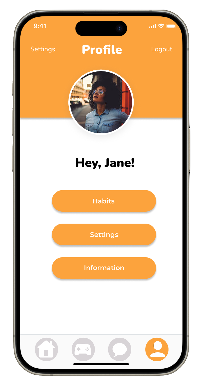
- User Registration - Implement a registration process for users to create an account, allowing them to save their progress and personalize their experience.
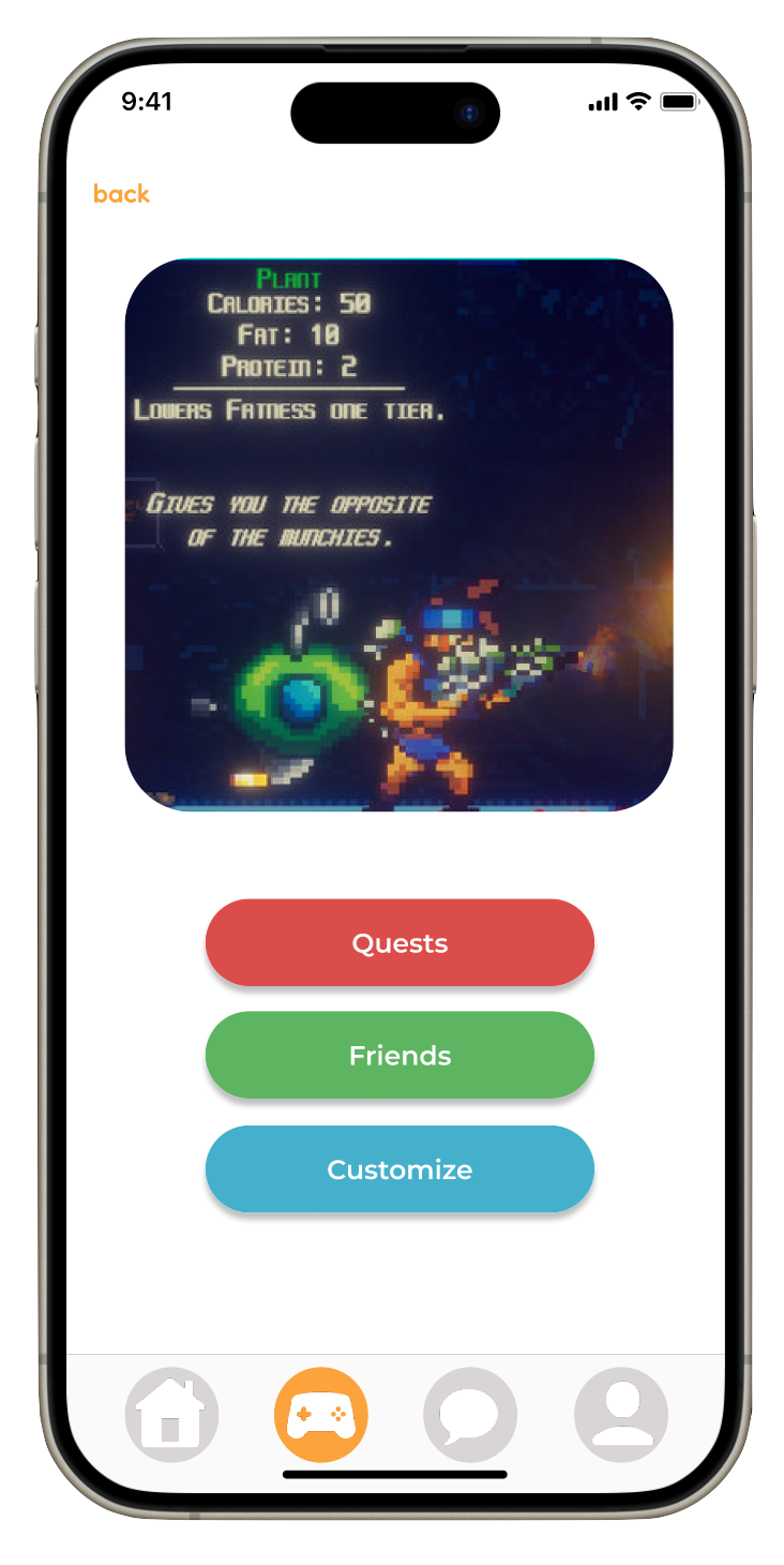
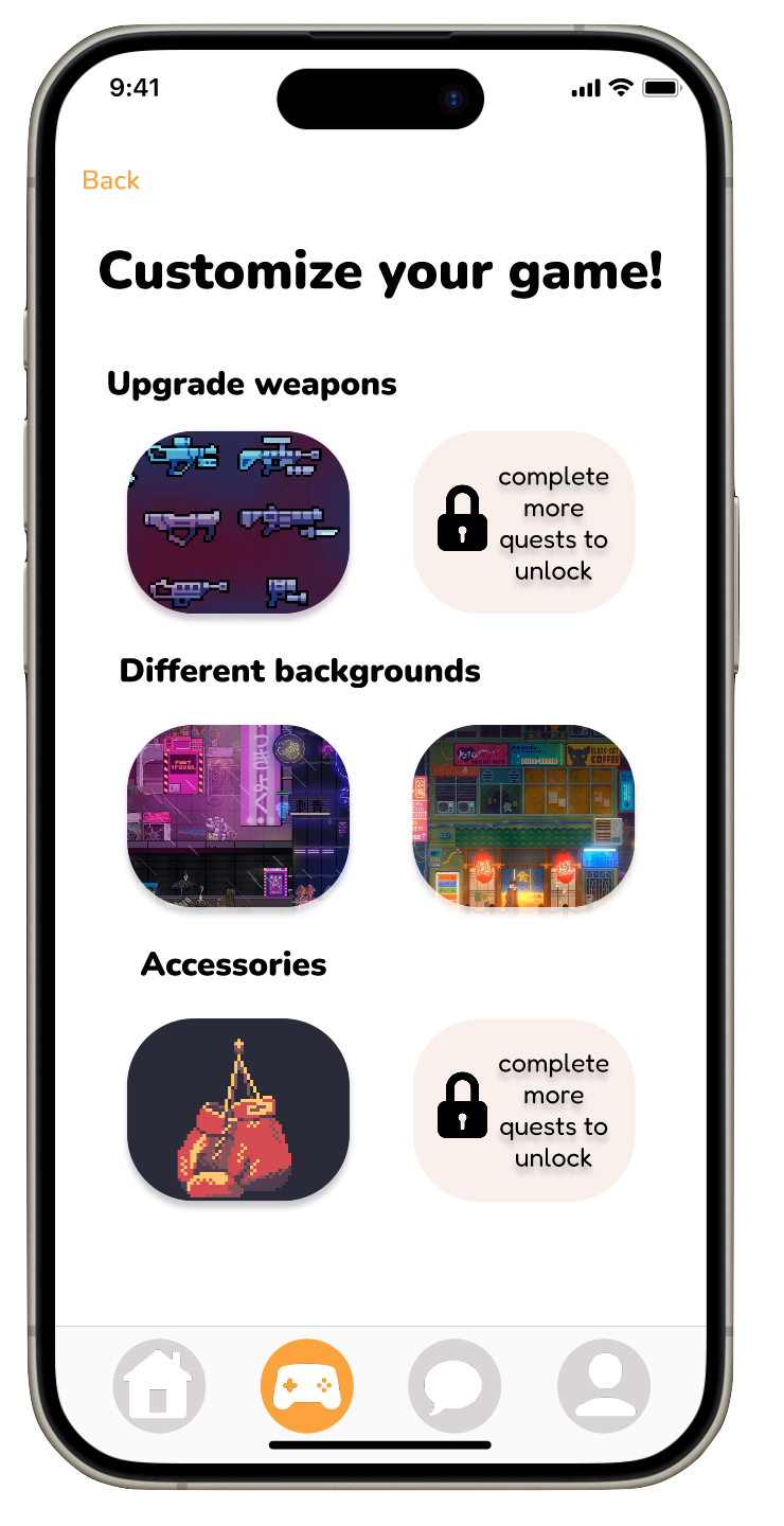
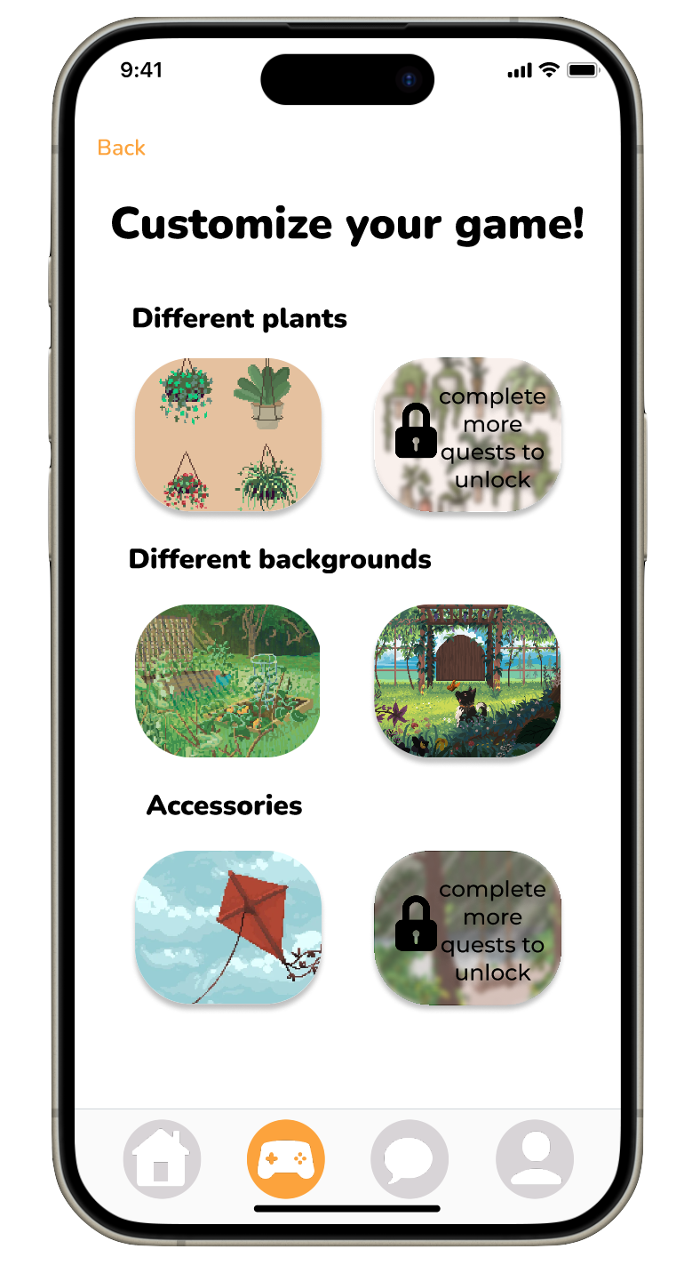
- Customization Options Provide users with customizable features to tailor their app experience according to their preferences and needs.
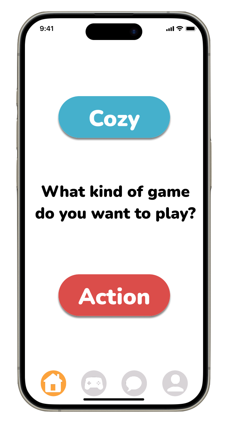
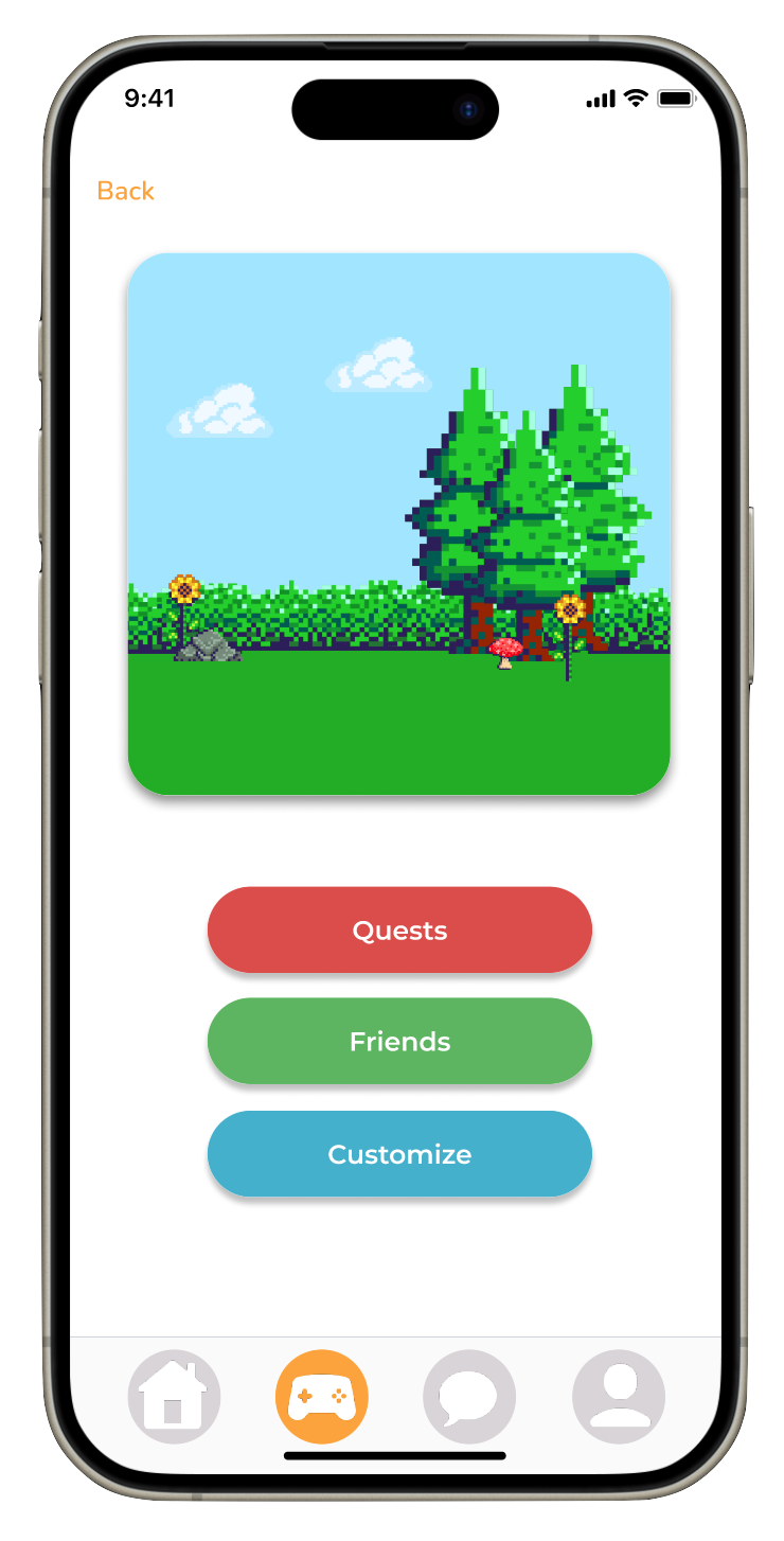
- Gaming Style Selection - Offer options for users to choose different types of gaming styles based on their moods and preferences, enhancing engagement and relevance.
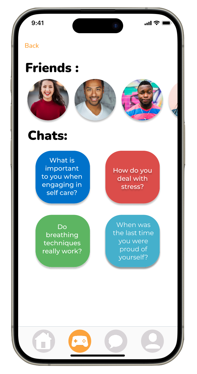
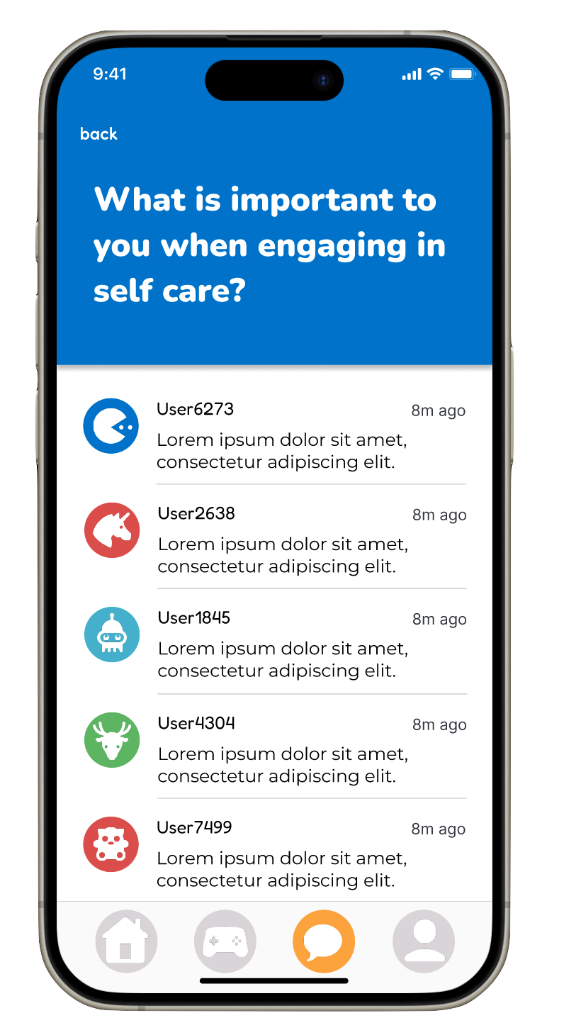
- Chat Feature - Integrate a chat feature to facilitate community building and allow users to interact, share experiences, and support one another.
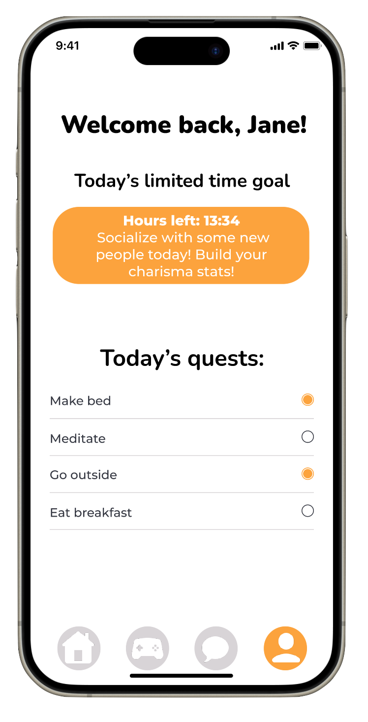
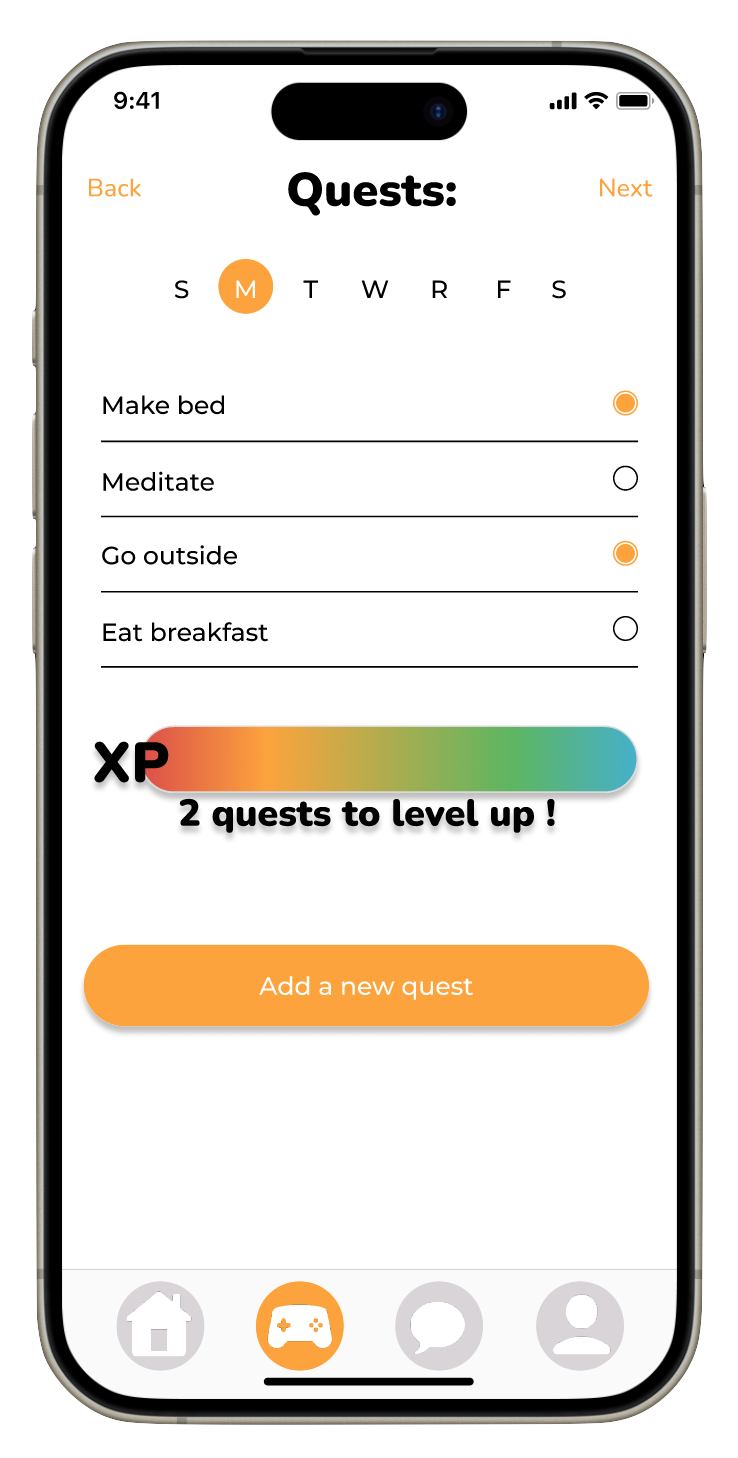
- Suggested Self-Care Goals - Include a system for suggesting self-care goals based on user preferences and activities, helping users set and track meaningful objectives.
- Game Tasks Linked to Goals - Design game tasks that are directly linked to users’ self-care goals, encouraging them to complete tasks that contribute to their overall well-being.
- Reminders - Implement reminders to prompt users to complete their self-care goals and to open the app, ensuring consistent engagement and adherence to their routines.
Final Product
Key takeaways
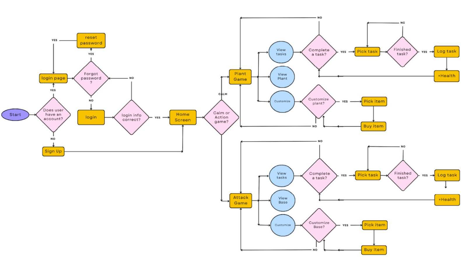
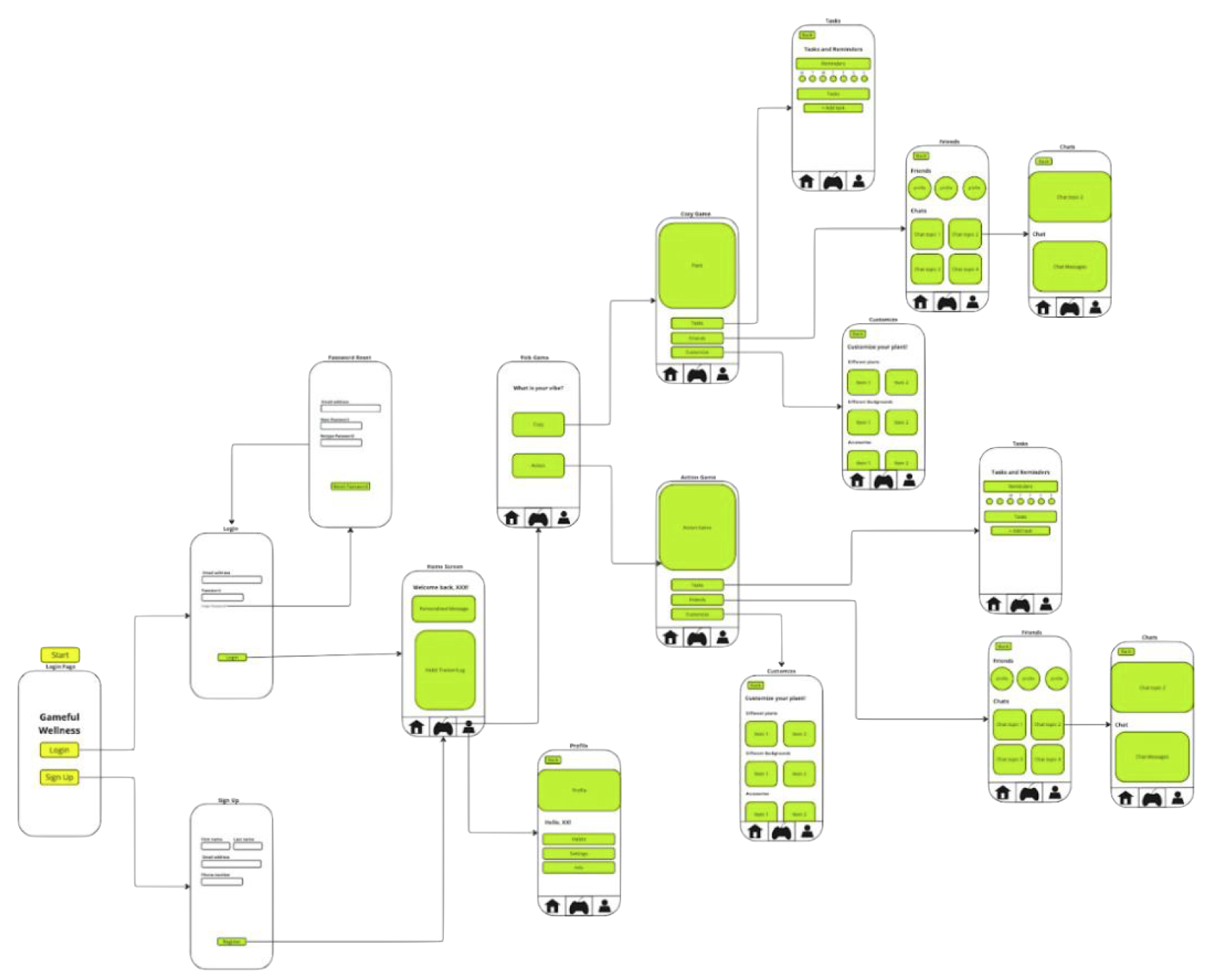
Creating the wireflow was more challenging than anticipated, as it required careful consideration of how each button would function and where it would lead users. Although the wireflow itself doesn't require extensive detail, it demanded significant thought to ensure the application was logical and met user needs.
Additionally, I used Figma to develop the prototype. While the visual design process in Figma was relatively straightforward, connecting various pages for the interactive prototype proved complex and confusing.
In the future, I plan to continue using Figma and aim to enhance my familiarity with the program to streamline the design process and reduce the time and confusion experienced during this project.
View other projects here: